Curating the user experience on UNB.ca
Author: Sean Sullivan
Posted on Nov 20, 2017
Category: Web and Social Media
Website refresh update
One of the primary goals of the University of New Brunswick’s website refresh project is making our sites easier to use. This extends beyond design, and includes creating meaningful and relevant content that’s simple to understand and navigate.
That’s one reason why we’ve embraced content strategy as an important part of our website planning process. As Usability.gov explains, “Ensuring that you have useful and usable content, that is well structured, and easily found is vital to improving the user experience of a website.”
We’ve taken this to heart as we continue refreshing the 100+ websites that make up UNB.ca. Over the past few months, new websites for the Faculty of Engineering, Faculty of Law, URec, Scholarships, the Primrose Scholarship and more have launched.
With more than a dozen others now in development, we wanted to show a few ways in which we’re helping faculty and staff develop smarter websites that put the needs of users first.
Faculty of Engineering
Creating a consistent look-and-feel
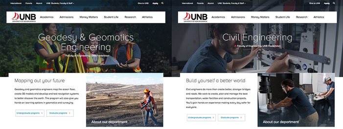
As the previous Faculty of Engineering website evolved over the years, each department’s website began to grow apart in how content was structured. While each was strong on its own, having different layouts can create a challenge for website visitors, who have to “learn” a new navigation for each site. This is especially true for future students, who may explore each departmental website while considering UNB.
Putting the user’s needs first is a key tenet of website development, so we looked at how we could unite these five websites, each of which is managed independently.
After reviewing how other universities have tackled this challenge, and in consultation with the faculty, we mapped out a structure for the departmental websites. They now share a common look-and-feel, as well as consistently structured pages on undergraduate programs, graduate programs and research — all of which have been updated to add new images and meet best practices for web writing.
Departments have the freedom to show their unique spirit through imagery and compelling text, and we can be assured that web visitors who journey throughout multiple departments can navigate easily.
One way we can measure the success of this is by looking at bounce rates, which measure the number of web visitors who leave a page immediately after viewing it (and without clicking any links). Since the website launched in September 2017, the bounce rate on departmental pages has been almost cut in half from the previous year — from 54 per cent to 28 per cent.
Scholarships
Clear pathways and easy searches
One in two high school students receive a UNB scholarship, so we know an easy-to-use online scholarships application and website are essential to our students. In 2016 alone, the scholarships website had more than 34,000 unique visitors — it’s an important destination for future students in planning their education at UNB.
The new website for the Scholarships office features a clear, scrolling page that introduces visitors to UNB’s scholarships process and guides them through the application process.
The Marketing office has made search-engine optimization a priority for new websites, and Scholarships is no exception. Many of these visitors find the Scholarships site through Google, so writing simple and clear page descriptions (called “meta descriptions”) for Google’s search engine was essential. Web visitors who search for UNB scholarships on Google will now be able to jump directly to the page they need.
For specific questions about UNB’s website refresh project, email digital@unb.ca.


