When to use our primary and secondary colour palette
Author: Marketing
Posted on Jun 8, 2017
Category: Brand
Colour plays an important role in constructing strong brand identity. Many of the most well-known brands rely on colour as a key factor for instant recognition. To strengthen our brand and increase awareness, UNB has an official primary and secondary colour palette. Using our colour palettes will make your projects truly reflective of the UNB brand and will help us tell our story to the world in a dynamic way.
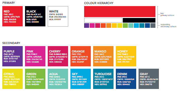
UNB’s primary colours are red, black and white. These colours reflect UNB’s personality, history and unique story and are used in our logo, website and virtually all of our marketing materials. When developing posters, advertisements, brochures, etc. always include our primary colours. UNB also has a secondary colour palette featuring 13 different colours that were chosen to allow for variety while maintaining our brand identity.
UNB’S official colours
You might be tempted to use all of our colours at once, but too many colours can be distracting and take away from your overall message. Keeping colour combinations simple makes it easier for viewers to understand your content and conveys a stronger message. For example, the below poster demonstrates an effective use of both UNB’s primary and secondary colours:

Colour plays an important, powerful role in the way we showcase ourselves to the world. A consistent use of brand colours will increase our visual identity, make us stand out and be instantly recognizable to the world.